For those of you who missed the WWDC MMXIII keynote address last Monday, you could watch it on your Apple TV or online. There was a lot of exciting new stuff and results discussed. The new OS X Mavericks looks awesome, amazing statistics that confirm ongoing success of Apple products, and to me the end was a big dream come true - iOS in automotive! However I'm going to focus on iOS, the mobile operating system. First, I think it's worth pointing out a few points that Tim Cook made, then I will go into an overview of the new features (from someone who has been using it for a week), and finally a summary of my impression.
Data Points
- 95% of iOS 6-capable devices are running iOS 6. If you look at Android, fully 1/3 of Android devices are running an Android version that is 3 years old. Only about 5% are running on the current version.
- This is a nightmare for developers, who have to develop to a myriad of OS versions, let alone a myriad of device hardware configurations (hardware features, screen sizes, etc.)
- This is bad for users, because the latest security patches (even more necessary on Android than iOS), features, performance enhancements, features - all are not available to the vast majority of Android users.
- Of iOS vs. Android users, iOS users use the Internet 1.5x more than equivalent Android users. That means, they are both using their devices more, and getting more use and value from them.
- Because of all this usage and stronger customer relationship with Apple, iOS devices enjoy a large margin of customer satisfaction (JD Power award 9th consecutive year). Unprecedented, and unrivaled.
My Summary of New Features
The underlying philosophy change in iOS 7 can basically be summed up in one word: simplify. Simplify everything to as basically elegant a design as possible. And yet, under the hood, everything is developed with even more sophistication, features, and capabilities. This is the true art of creative innovation, to me. If you can devise something that is even more clever, even more complex and sophisticated - and yet, even more simple and intuitive, you have stayed in the zone.

- Lock Screen
- On iPhone 4S/5, you get a 3D parallax effect when you tilt the phone, that makes it look like the wallpaper is floating behind the rest of the items on the screen. Cool.
- Swipe the whole screen to unlock
- When a notification pops up, you can slide just that notification to respond exactly to that one. If you have a passcode, you will be prompted to unlock.
- Beware: the "Slide to unlock" animation is very subtle, so you want to either choose a backdrop that doesn't cover it up, or modify one to reserve an area to make it more visible.
- Home Screen
- Same 3D parallax effect with the wallpaper
- Note the flat, simplified icons
- System-Wide: Notification Center and Control Center
- Swipe down to get Notification Center as usual, but it is enhanced with better, more usable content. You can look at upcoming calendar, weather, stocks, etc. (customizeable), as well as All, and Missed
- Notification handling cloud synch - if you use the same iCloud account on multiple devices, when you respond to a notification, it marks that response on all devices.
- Swipe up from the bottom of any screen (including Lock screen) to get the Control Center, a quick access to common controls like Airplane Mode, WiFi/Bluetooth on/off, etc. (One wish: it was customizeable). New: Flashlight! (I feel sorry for all those developers with Flashlight apps.)
- New built-in Apps
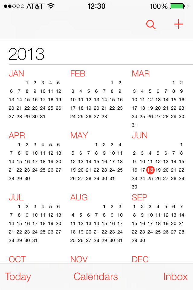
- Calendar rocks - you can zoom out to the year
- Music app - now plays iTunes Radio (like Pandora), plus you can stream your music right from iCloud instead of having to have it local.
- Better navigation across albums
- Missing the 5-star rating function, hopefully they put that back in before release
- Phone app is actually a really cool, "basic" look and feel. The show-through colors from your wallpaper make it seem to match your mood better.
- Friggin sweet Weather app with animations, again pinch to zoom out and see all your locations as an overview.
- Upgrade on Safari simply rocks. Unlimited tabs, better tab UI, synch of tabs across devices, Keychain (think passwords) synch, etc.
- Photo app is simply breathtaking. Finally, you browse your pictures the way you are thinking at the moment. By event? By face? By year/date? By location they were taken? And it's easy to share (especially if you have newer devices and can use AirDrop).
- System-wide control flow
- Swipe to the left to remove/throw out things, pinch to zoom out scale and more, and animated transitions give you a better sense of where you are going to and from, and how to get back.
- New App Switcher
- Double-tap Home button, you get thumbnails of the running apps. Swipe up to "throw out" an app.
- True multitasking now allows all apps to continue to run in the background, with an intelligent resource manager that keeps good battery life. They held off on it until they could get it right, without compromising the already short battery life.
- Search from Any Page
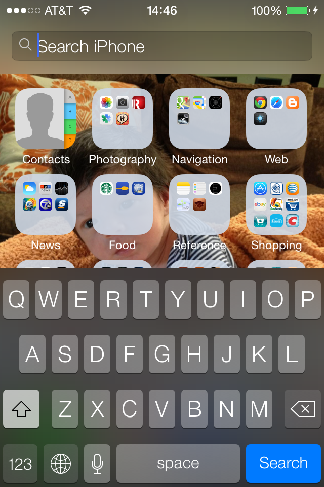
- Finally, just pull down any home page to get a search bar. No more having to swipe many times to the right, or home button again, then swipe right. Very nice.
- Block Callers
- I can't tell you for how many years this has bugged me! You want to block that annoying text spam company? That "friend" you unfriended, who keeps calling you? You can block phone calls and texts from individuals.
- Siri
- Wow!! Wow!! Let me say it again.
- The little voice wave at the bottom and the animations, it is really cool while still minimalist.
- However, the biggest improvements here are truly epic:
- Access to the phone ("Make it brighter", "Turn on Bluetooth", etc.)
- Tap to edit - you can tap her textual interpretation of what you said, and edit it. Brilliant (my definition of genius - you say "it should have been there all along" but you never thought of it)
- You are supposed to be able to change voices on Siri - mail, female, multiple choices, other languages. I haven't found how to do this yet, but it sounds intriguing. One of the things I liked about MotionX was different voices to choose from.


My Impression
I have to admit, initially I really wanted to hate the new look - all flat, all the "real-world" look-alikes (stitches, wood, brushed aluminum, push buttons, etc.) gone to be replaced by muted colors, lack of borders, and the Contacts, for example, words on a blank white page. However, I find that very quickly it has grown on me. The partial see-through screen sections give it a familiar feel to the wallpaper I set. The animation transitions give me an instantly comfortable sense of where I am, where I am going, and how I got here, and how to get back. It is amazingly well thought out.
And, the 3D parallax effect? Epic. Those of you with an iPhone 4, you'll have iOS 7 without the 3D. Bummer. Those of you on older devices? Big bummer. Big.
Now I need to make you aware of a strange phenomenon. I initially found a lot of bugs, and the first night it crashed on me like 20 times or more. I reported these bugs with Apple Bug Reporter. It says, and I fully expect, no follow-up to the myriad of bugs I am sure are getting reported by the tens of thousands of bug reports every day. However, most of them have simply gone away. I suspect that either the OS fixed itself, or Apple pushed out updates (in priority order) behind the scenes. Anyhow, it has only crashed itself once in the past couple of days, and is starting to work like a Released iOS, not a Beta 1.
FYI, that unbelievably cute picture on my wallpaper - my new nephew Isaac. It is so cool that I can tip the phone to move the icons out of the way and see his face!


No comments:
Post a Comment